About
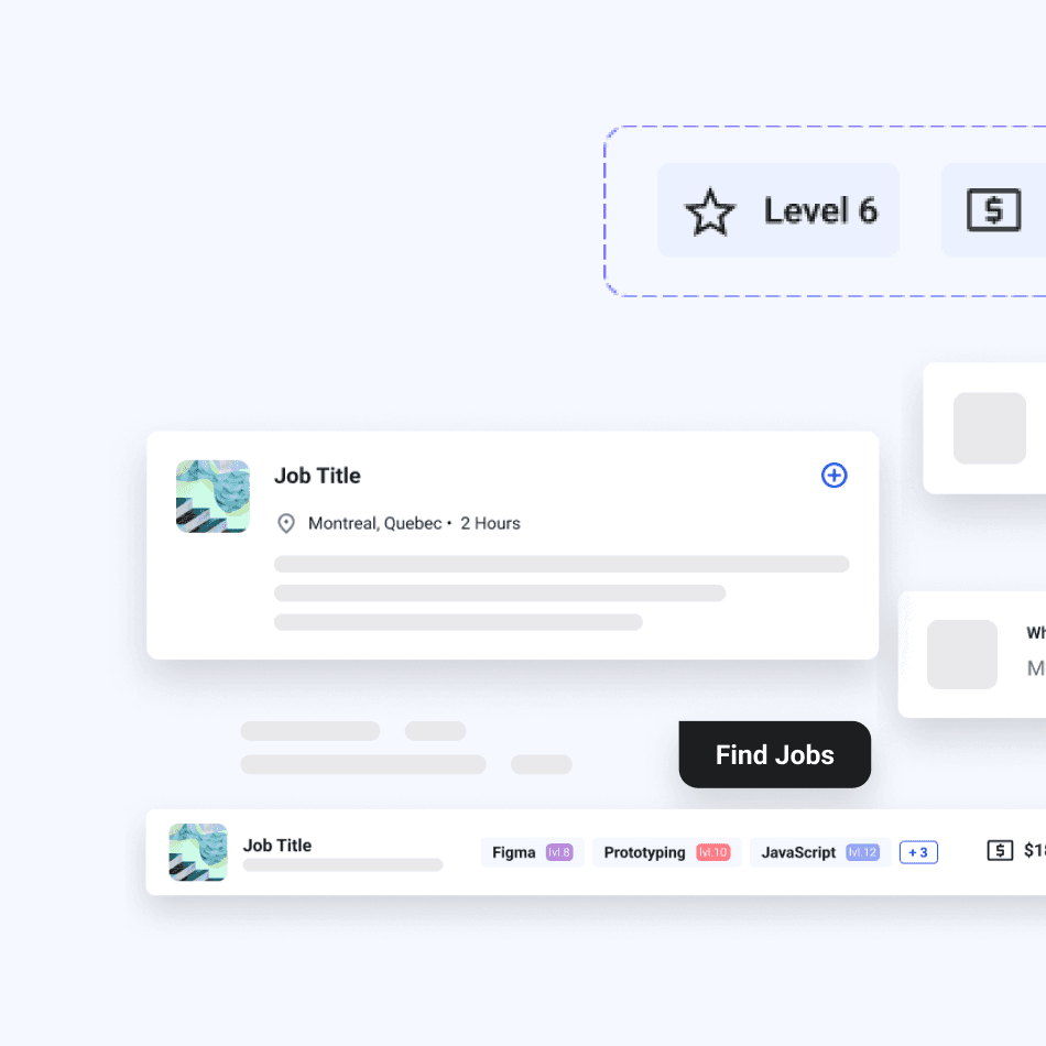
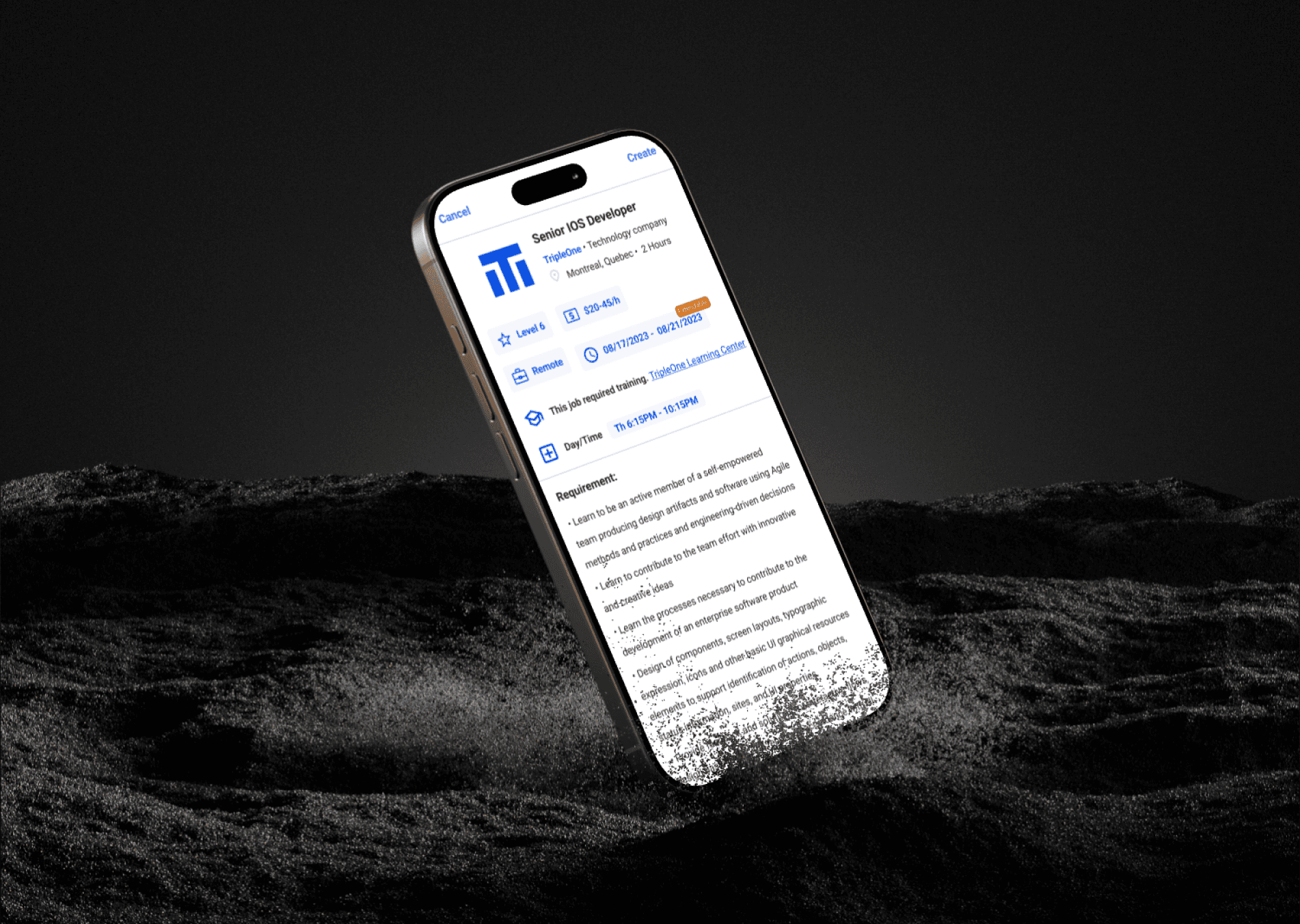
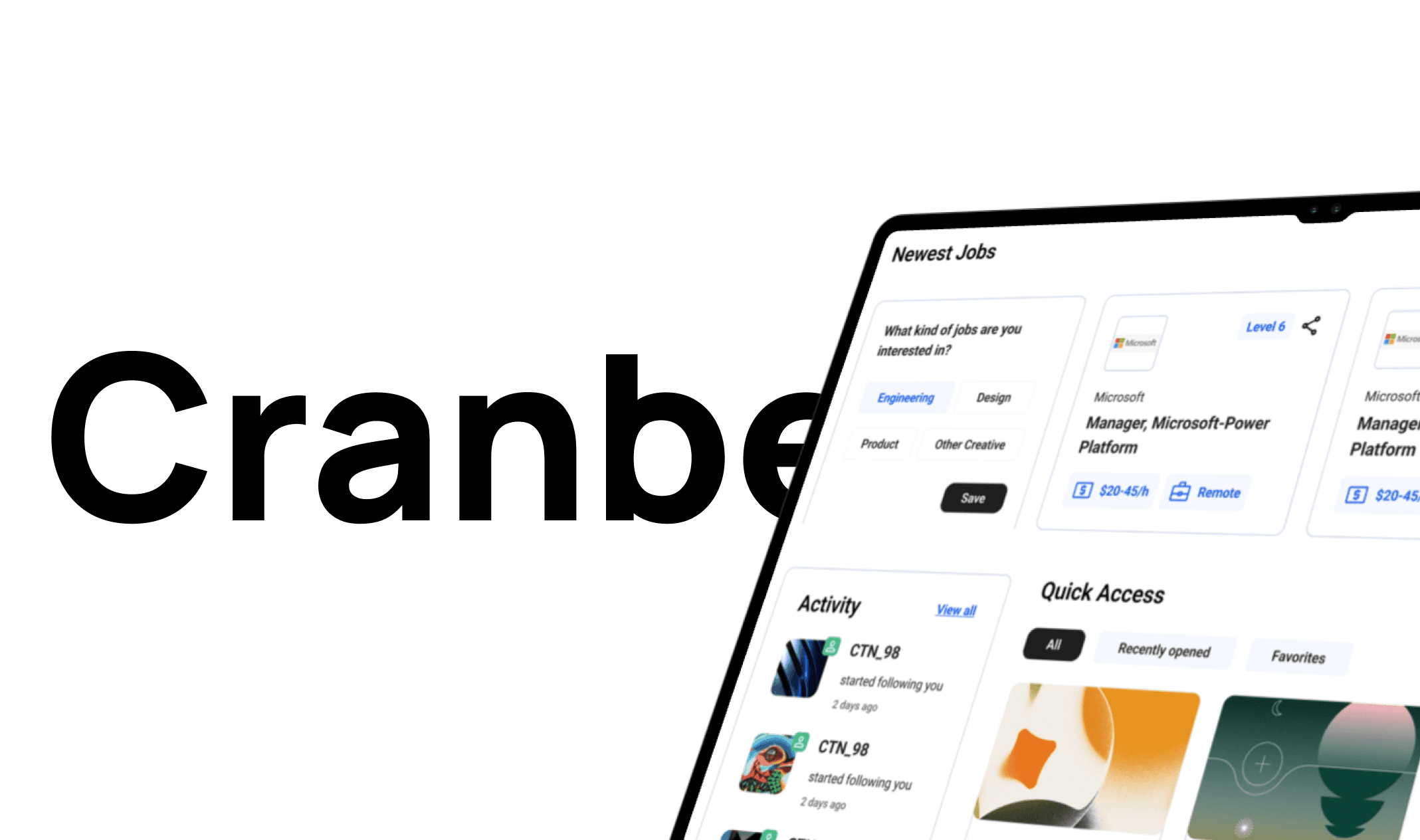
I led the design of a job posting feature for Cranberry, aiming to streamline job discovery and application processes. By adopting an Agile UX approach, we iteratively improved the experience for both job seekers and employers, enhancing overall usability and efficiency.
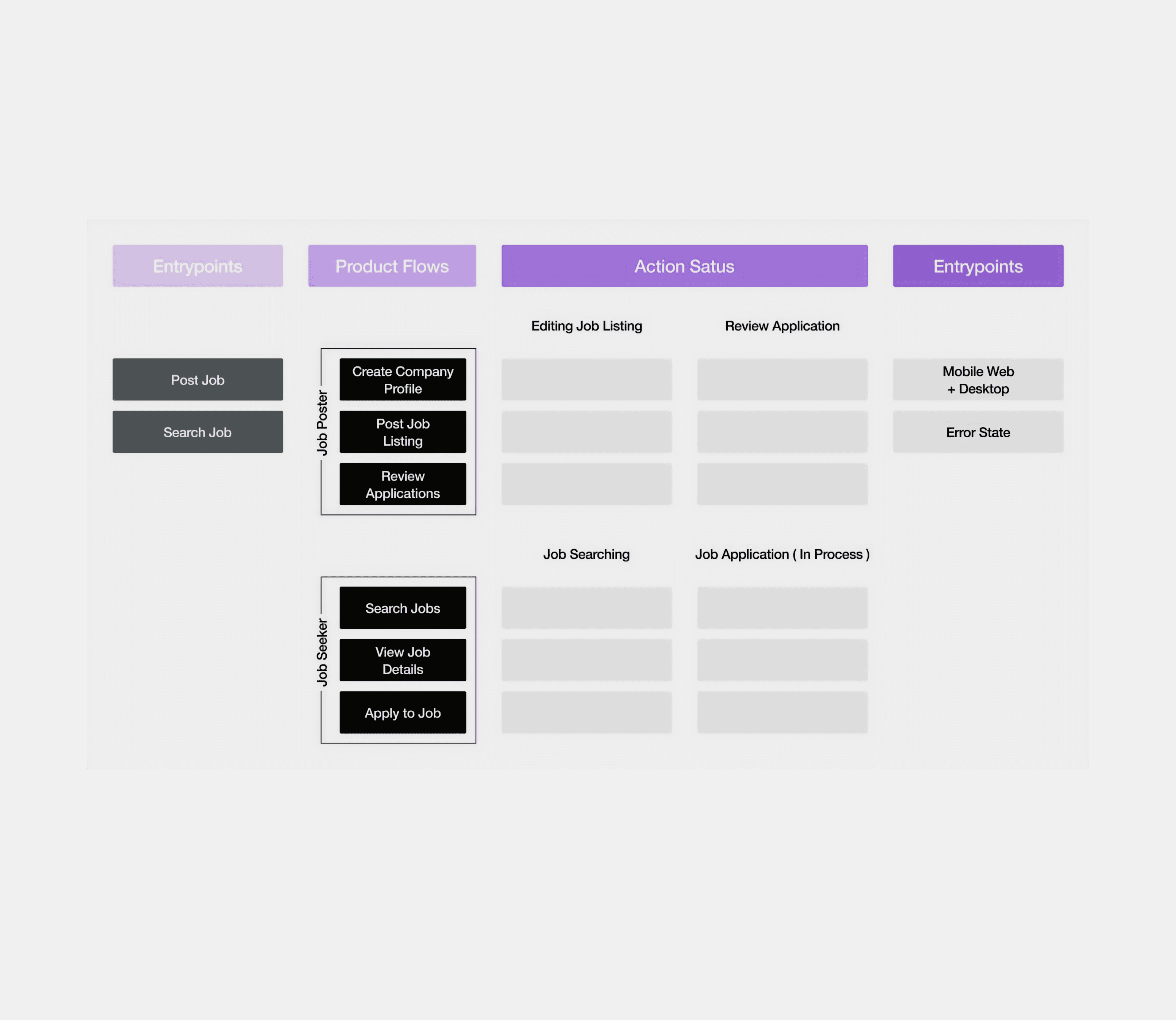
Design Process
Agile UX
We began the project by clearly identifying the key challenges. This approach allowed us to continuously gather feedback and optimize the product based on user needs.
01 Sprint 1—Research and Initial Ideation
We began with rapid user research and competitor analysis. During this sprint, we identified pain points in existing job platforms like LinkedIn and Indeed, including interrupted exploration flow and overwhelming information. Based on these findings, we sketched out initial ideas and defined key challenges.
02 Sprint 2— Prototyping and Testing
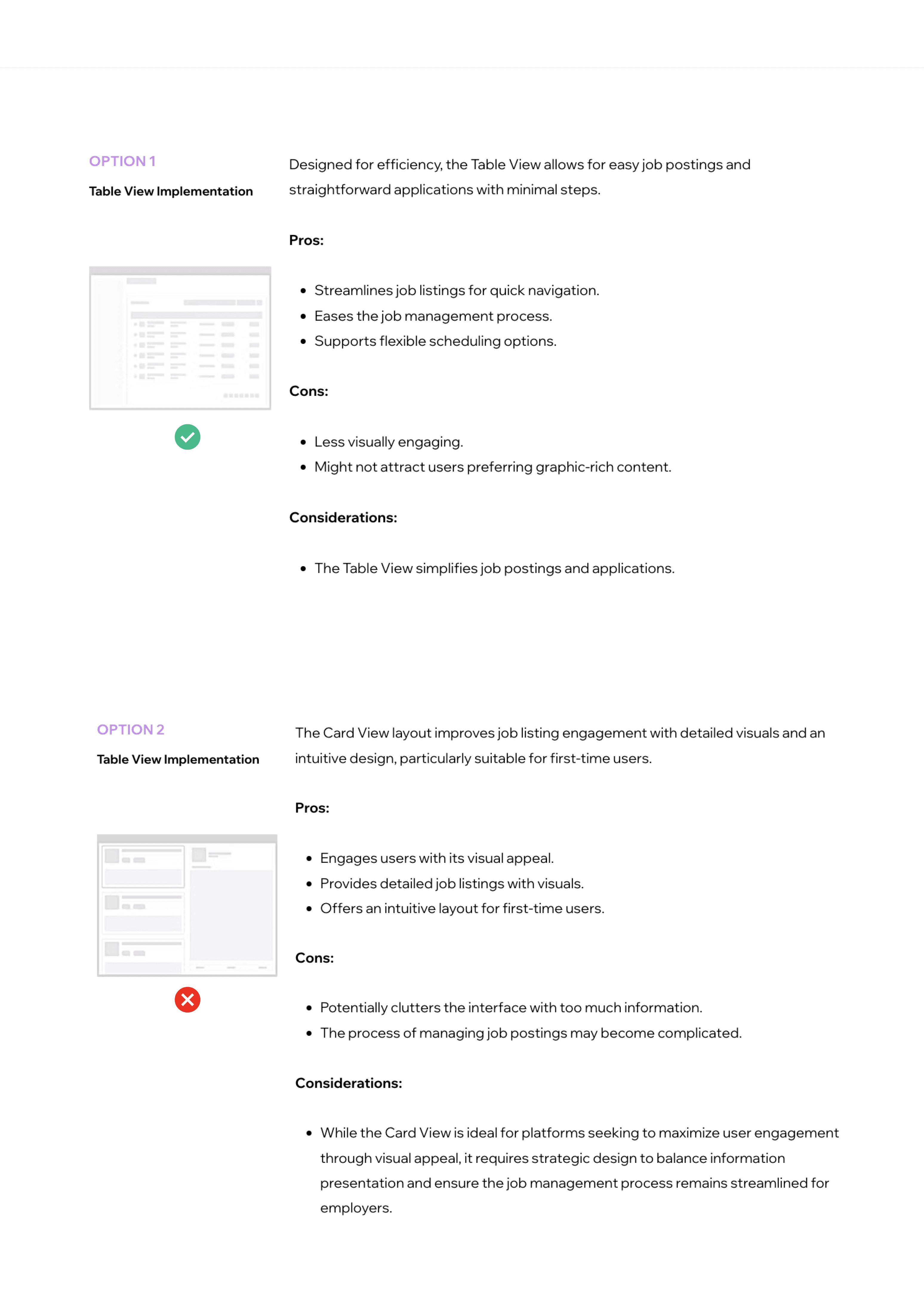
In the second sprint, we built low-fidelity prototypes (Table View and Card View). Using Agile cycles, we conducted usability tests after each iteration to gather feedback quickly. We focused on making the application process smoother for job seekers while simplifying job postings for employers.
03 Sprint 3—Iteration and Refinement
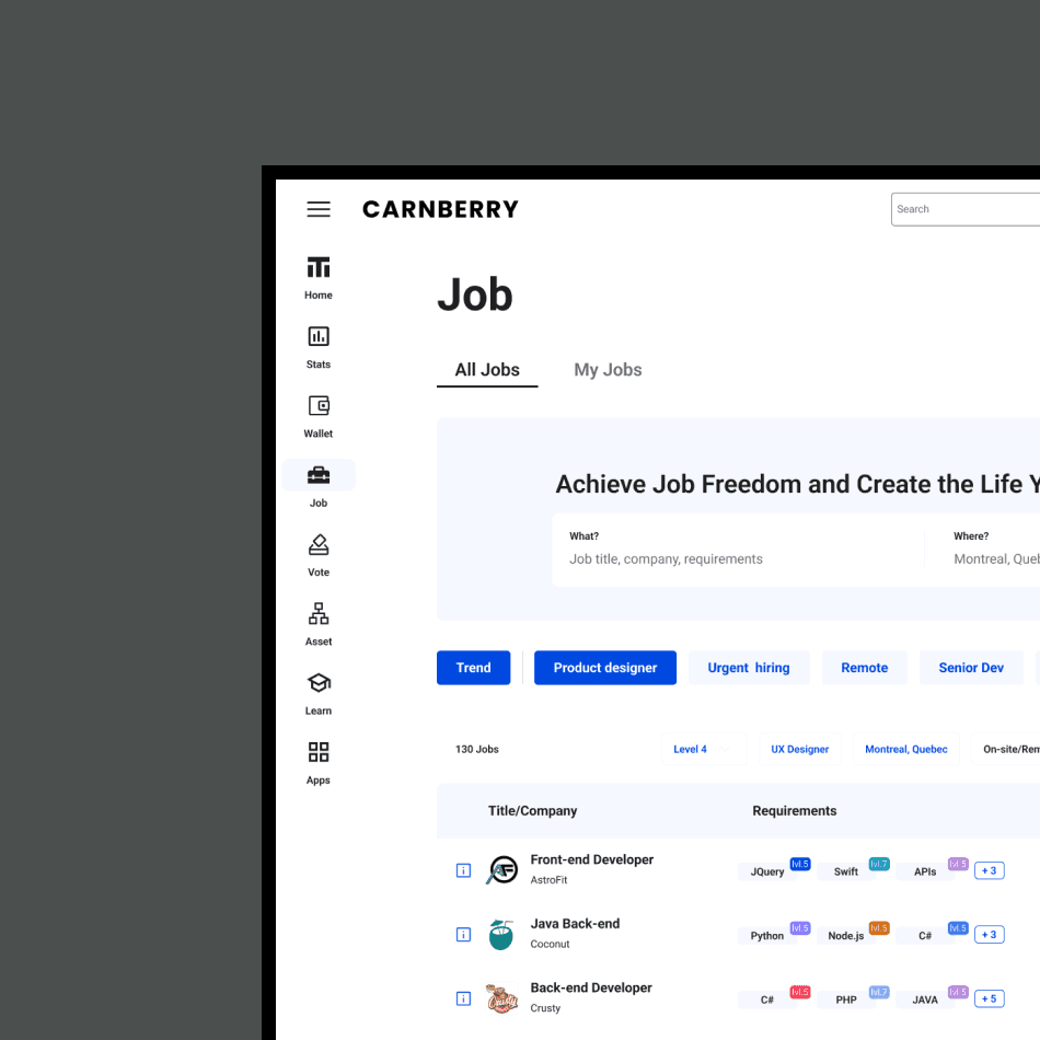
After evaluating user feedback, we chose the Table View design for its efficiency. Over subsequent sprints, we refined the interface, focusing on clarity and improving mobile usability. We continued to test and iterate, responding to user feedback in real time.
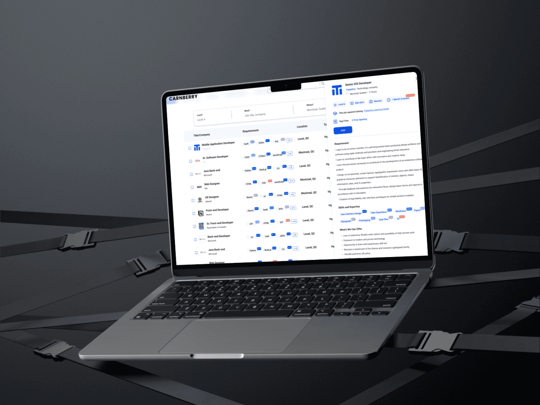
Outcome
The Agile UX approach allowed us to deliver a more efficient job posting and application system.
User research
results & findings
Our research identified key pain points for both job seekers and employers, which we addressed iteratively through Agile sprints.
01 Interrupted Flow
Users struggled with navigating job listings due to confusing layouts on existing platforms.
02 Information Overload
Users found detailed job listings hard to scan, leading to frustration.
03 Mobile Inefficiency
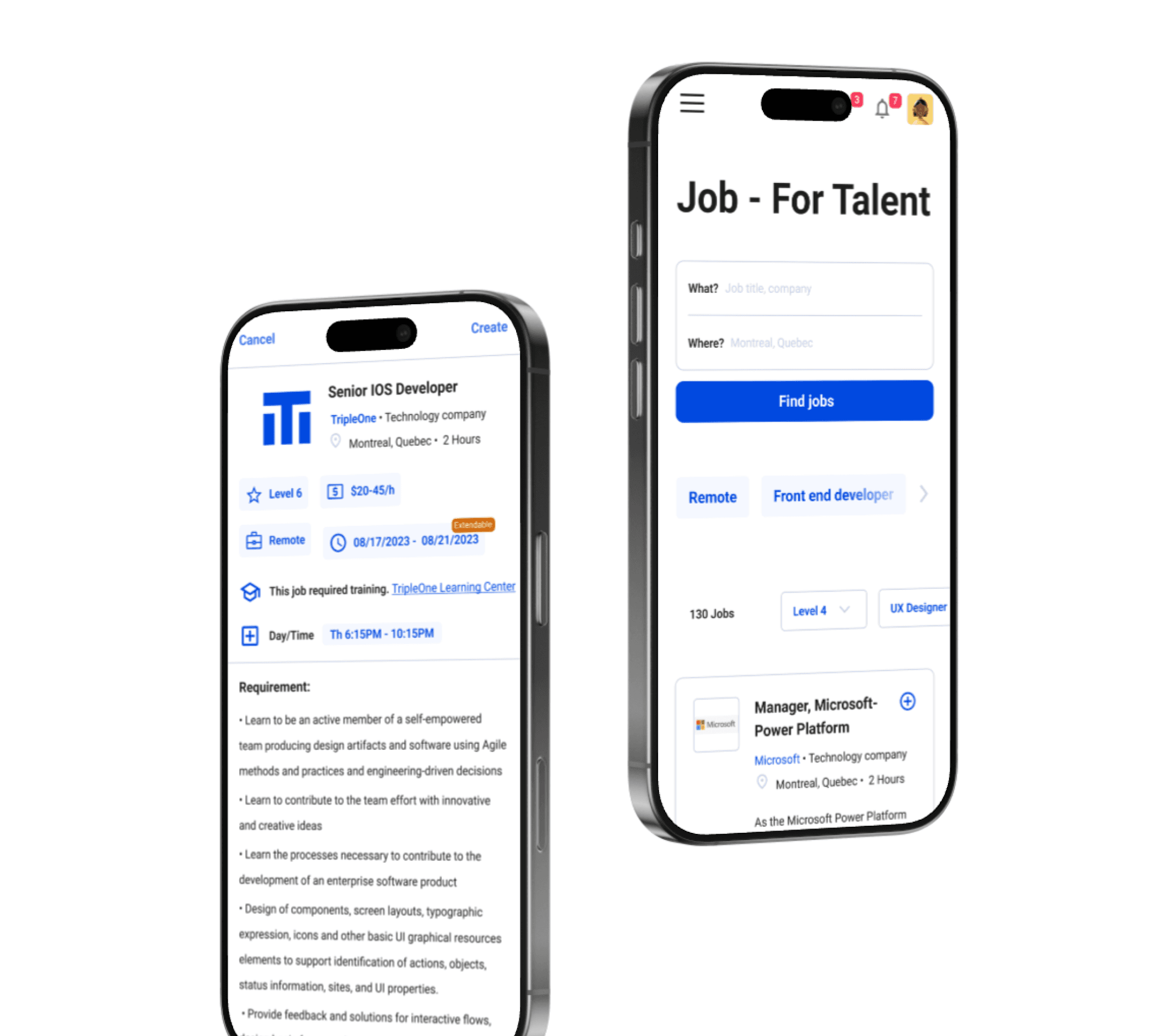
Job seekers faced difficulties with slow and clunky mobile interfaces.
Challenge 01
Simplifying Time Scheduling
How might we create a flexible and easy-to-use scheduling interface for job postings?
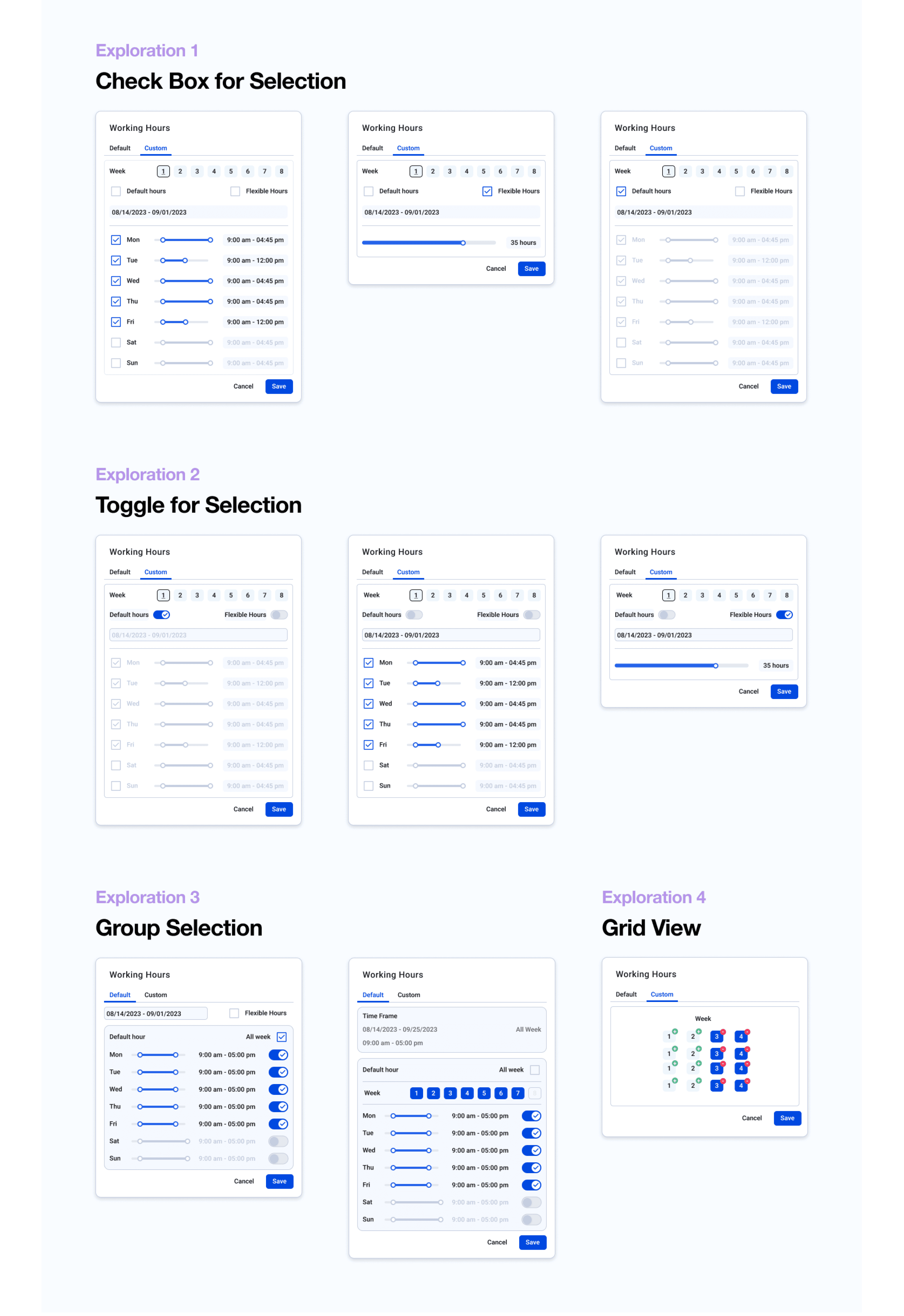
The final solution is a tabbed interface that divides the time picker into two clear options: a Default Time Tab for quick selections of commonly used schedules and a Custom Time Tab for users needing precise, tailored scheduling.
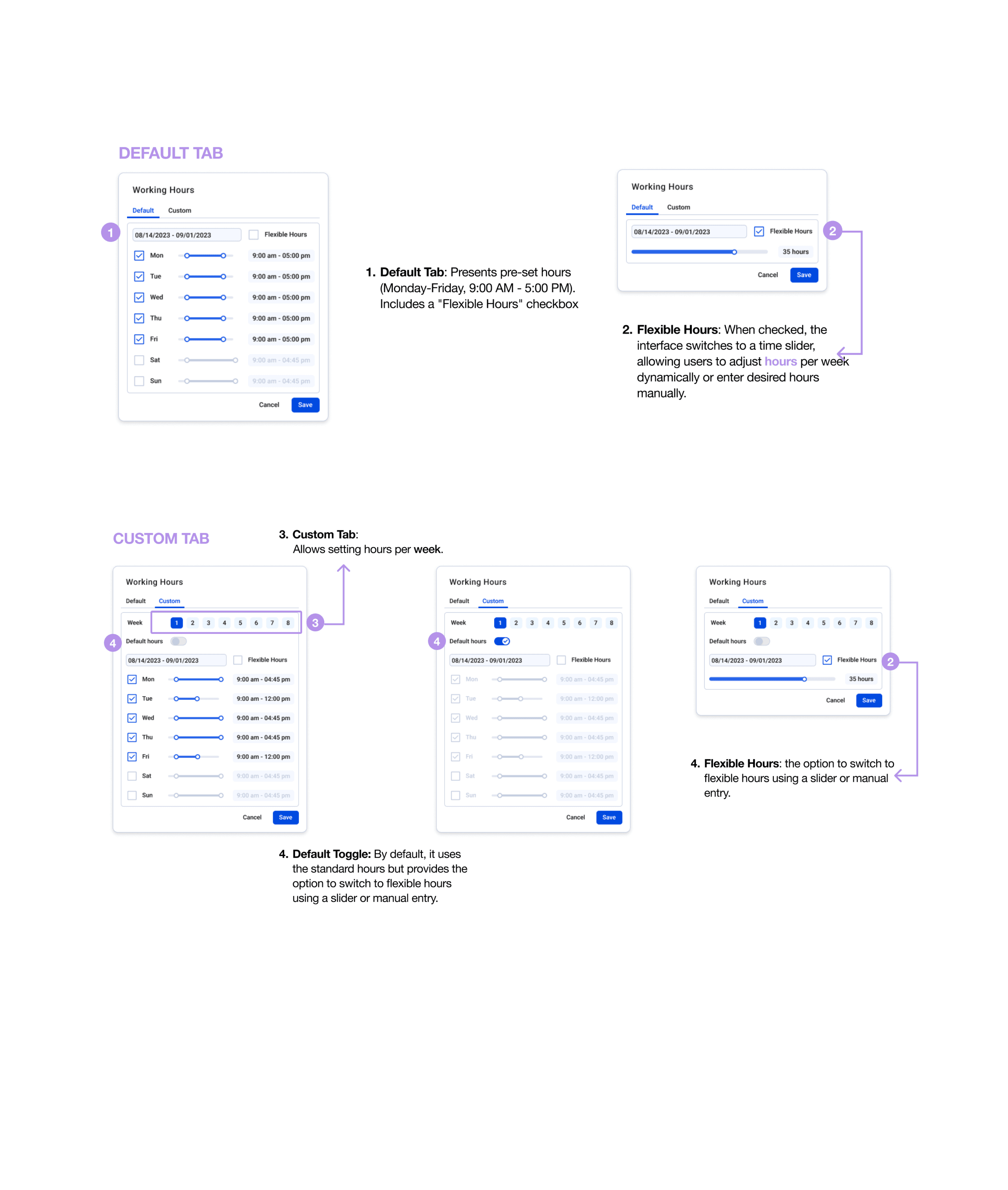
Ideation and Exploration
Exploring Simplicity and Flexibility
The goal was to reduce the number of actions required while maintaining flexibility for various user needs.
To address the challenges of time scheduling, I explored several interaction models: Checkboxes for pre-selecting times Toggles for activating options quickly Grouped Patterns for frequently used schedules Grids for visualizing time blocks
Challenge 02
Reducing Information Overload
How might we reduce information overload in job listings while maintaining necessary details?
We explored two layout options to improve the user experience for job postings: Table View and Card View. Each option was evaluated based on usability, efficiency, and user engagement.
Final designs Employement details
With that, The concept and design were recognized by various stakeholders and industry target users, we have received a lot of positive feedback.